By Haidee C. Pineda, images courtesy of Dan Matutina
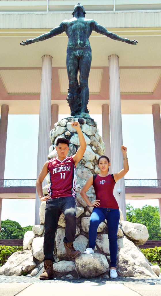
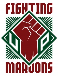
(JUL. 20)— A raised clenched fist, symbolizing the UP community’s spirit of solidarity, is now the official logo of the University of the Philippines (UP) Fighting Maroons.
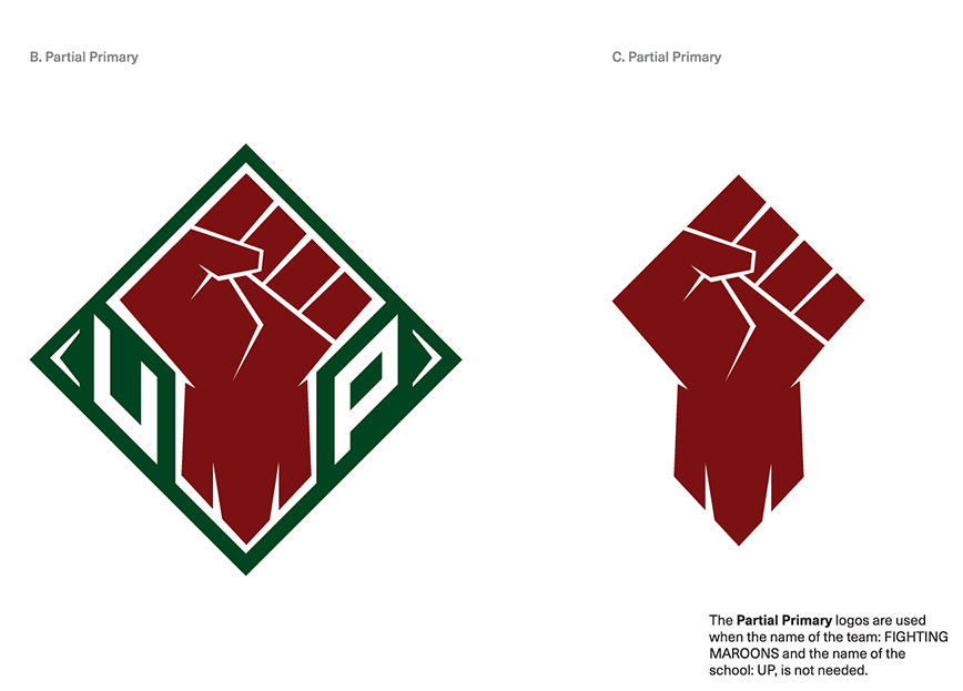
The logo consists of a maroon clenched fist with the letter “M” cut at the wrist and sandwiched between the letters U and P. The words “Fighting” and “Maroons” are inscribed on top and bottom, respectively.
The logo will be used by all varsity teams in all competitions.
A design team comprising esteemed UP alumni in the graphic design, advertising and branding industry created the official logo with the help of #nowheretogobutUP, a volunteer alumni group generously supporting UP student athletes.
The logo, which will be formally launched in August, comes at a most auspicious time: UP is hosting the University Athletic Association of the Philippines (UAAP) this season.
“There was no official logo for the UP Fighting Maroons, so the UP Seal was usually attached to the jerseys of the student-athletes. Moreover, the use of UP System-registered trademarks like the Oblation and sometimes the UP Seal in UAAP broadcasts are unofficial renditions meant to identify the UP teams,” noted a statement by #nowheretogobutUP.
It added that “because UP is the host of the upcoming UAAP Season 78, the concerned UP offices (the Office of the Chancellor, the Office of the Vice Chancellor for Research and Development, the College of Human Kinetics and the College of Fine Arts) have decided to create an official logo for the UP Fighting Maroons.”
The design team developed a main logo with two partial primary versions; a secondary logo depicting the M Fist/Fighting Fist; a tertiary logo with Isko and Iska; and an internal logo with the Oblation.
The main logo, depicting a raised clenched fist, symbolizes the UP community’s spirit of solidarity, while the letter “M” cut at the wrist stands for “Maroons.”

Dan Matutina, the design team’s head and co-founder of Plus63 Design Co., said “sifting through all the comments and suggestions from students and alumni, the team realized that the raised fist represents the UP Fighting Maroons. It best represents the ‘palaban’ nature of The Fighting Maroons. It’s also a logo that works well within the competitive and assertive nature of the games.”
“This symbol also reflects the university’s history of activism. It’s a rallying visual for people to come together and fight for something they believe in. We want people to immediately think ‘UP’ when they see the logo. And we think they do,” he added.
The partial primary logos serve as variations of the main logo and will be used when the name of the school and team are not needed. The secondary (“M”) and tertiary logos (Isko and Iska) can be used for merchandising and promotional materials.
The internal logo (Oblation) can be used as design element on the athletes’ uniforms.
However, UP has ownership and exclusive rights to the use of the Oblation and determines how it should be used for external purposes, such as in merchandising and other promotional materials.
The Design Team. The members of the design team, who worked pro bono, are: Dan Matutina, Kay Aranzanso, AJ Dimarucot and Ralph Guibani. Mandy Reyes and Pete Jimenez served as team coordinators.
Matutina, a College of Fine Arts (CFA) alumnus, is a designer and illustrator who has worked on projects for companies such as Google, Pinterest, Airbnb, Samsung, Blackberry, WIRED Magazine, among many others. In 2013, he received the prestigious Young Guns Award by the Art Directors Club in New York. With him were Bernice De Leon-Yumul, Joanna Malinis and Raxenne Maniquiz, his co-founders of Plus63 Design Co., a design studio that creates brand identities, strategizes communications, designs and illustrates for print and web.
Aranzanso is a CFA alumna. She is a designer and illustrator dabbling in graphic design, illustration, murals and hands-on chalk lettering projects. She works with creative firms such as And A Half Design Studio and Ang Ilustrador ng Kabataan.
Guibani is a CFA alumnus and former UP Pep Squad drummer. He is currently a Junior Art Director for BCD Pinpoint and plays guitar for his band Verbacoma during his free time.
Dimarucot is a UP College of Engineering graduate. He is a graphic designer, entrepreneur and restaurateur. He is known in the crowd-sourced t-shirt design circles for having his art printed several times over at Threadless.com and Designbyhumans.com. His roster of clients includes: Nike, Jordan Brand, Adidas and Uniqlo.
Reyes, a College of Mass Communication (CMC) alumnus, is a veteran TV commercial director with more than 30 years of experience in the advertising industry. He is the founder of Industria, one of the leading production houses in the country whose client roster includes: KFC, Tokyo Tokyo, Mister Donut, Motolite, NutriAsia, Monde Phils., and Del Monte.
Jimenez, also a CFA alumnus, is a painter and a sculptor by profession. He is President of Optima Digital, the top post-production house in the country. His roster of clients includes: PLDT, Nestle, Procter & Gamble, RFM Corporation, Unilever, Universal Robina Corporation, among many others.

Reactions to the logo. UP Men’s basketball team captain JR Gallarza, who was among the varsity players consulted by the UP administration and the design team on the official logo, said “I honestly felt a sense of overwhelming pride when I saw that fist. I don’t know why I felt that way when I saw it, but I just do. I feel like it embodies the UP Fighting Maroon very well.”
Gallarza added he is positive that he can help generate positive reactions to the new logo by “using what today’s society is very much known for- social media. I believe that if I feel excited and proud about the logo, my peers and teammates would be as well.”
“The UP Fighting Maroons logo represents the student-athlete’s willingness to fight in the name of the University. It screams power, strength, determination and will. The fist is a great symbol of the Fighting Maroons, Fighting UP: we are known for literally fighting for our rights as individual UP students, faculty and athletes.” UP Varsity Pep Squad team captain Cam Lagmay said.
Lagmay intends to promote the logo “by representing it well and by making sure students are aware of the reason behind the need for a new logo. Also, the current logo and its underlying meaning have to be explained alongside its release in order for us to be one in our understanding of what the fist represents.”

Former Vice Chancellor for Community Affairs Dr. Cynthia Grace C. Gregorio said the logo “captures what every student-athlete embodies—fortitude, valor and strength. This is also the very symbol that impassions every member of the UP community to rally behind our athletes. In victory or defeat, at the end of the game, the clenched fist raised by our athletes and the UP crowd while singing our UP Naming Mahal is a testimony for our collective love and pride for UP.”
Department of Art Studies associate professor Dr. Eloisa May P. Hernandez, who is a faculty adviser of the UP Pep Squad along with Gregorio, said “At the end of every game, the UP Fighting Maroons sing UP Naming Mahal together with the UP crowd with raised fists. It’s a ritual, win or lose. I personally look forward to that moment. It’s a salute to our student-athletes for giving a good fight, as well as a moment of solidarity for the whole UP community. Win or lose, we are one for UP. For me, the UP Fighting Maroons official logo symbolizes that moment.”

